Fixed bottom nav icons overflow on iPhone Chrome when the toolbar hides (safe-area-inset-bottom)
My bottom tab bar looked perfect in Safari and in every emulator, then spilled its icons over the page on iPhone Chrome the moment the browser toolbar collapsed. The culprit was one CSS line I had copied from a dozen tutorials.
This site has a small tab bar at the bottom of the screen on phones: Home, Blog, Projects, GitHub. It is the most boring CSS on the site, and it is the part that broke. Safari showed it perfectly. Chrome on the same iPhone showed it perfectly too, right up until I stopped scrolling. Then Chrome hid its own toolbar, the page grew a little, and my icons floated out of the bar and over the text above it.
If you searched for something like "bottom navigation icons overflow iOS Chrome toolbar hidden", this is the article I wish had existed.
The symptom
- The bar is
position: fixed; bottom: 0, 60px tall, withpadding-bottom: env(safe-area-inset-bottom)for the home indicator. - While the browser toolbar is visible, everything is in place.
- When the toolbar collapses after a scroll, the icons and labels sit above the bar's top edge, overlapping the content.
- Safari never does it. Chrome does it every time. Emulators and desktop device mode never reproduce it.


Same page, same CSS, one scroll apart. The only thing that changed is whether Chrome was drawing its toolbar.
The cause
Two facts collided.
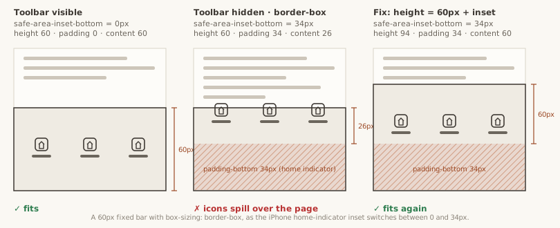
First, env(safe-area-inset-bottom) is not a constant. On an iPhone with a home indicator it is 0px while the browser draws its own toolbar over that area, and about 34px once the toolbar slides away and the page reaches the bottom edge of the screen. Chrome switches between the two values as its toolbar shows and hides. Safari keeps the layout viewport stable in a way that hides the problem on my pages.
Second, my whole stylesheet uses box-sizing: border-box, as most do. With border-box, padding is carved out of the height. So the bar was declared like this:
.bar {
  position: fixed;
  bottom: 0;
  height: 60px;
  padding-bottom: env(safe-area-inset-bottom);
}
Toolbar visible: inset 0px, content area 60px, fine. Toolbar hidden: inset 34px, content area 26px. My items were height: 100% with an icon, a gap and a label, about 44px in total. Twenty-six pixels cannot hold forty-four, and a flex column centres its overflow on both sides, so the icons escaped upwards, over the page.
The fix
Add the inset to the height instead of taking it out of it, and reserve the same space at the bottom of the page so the footer never hides under the bar:
.bar {
  position: fixed;
  bottom: 0;
  height: calc(60px + env(safe-area-inset-bottom, 0px));
  padding-bottom: env(safe-area-inset-bottom, 0px);
}

body {
  padding-bottom: calc(60px + env(safe-area-inset-bottom, 0px));
}
The 0px fallback matters: browsers without safe-area support evaluate the whole calc() to nothing without it, and you lose the bar's height entirely.
That is the whole fix. Two lines. Chrome documents the same recipe in its edge-to-edge guide, and Apple's forums confirm the inset flips between 0 and the indicator height as the toolbar comes and goes.
What I would tell my past self
- On phones, anything anchored to the bottom must add
env(safe-area-inset-bottom)to its size, not subtract it, because the inset changes while the page is open. - Test on a real iPhone, in Safari and in Chrome, and test the production build, not the development server. Safari and Chrome share WebKit, but their toolbars resize the page differently, and the safe-area inset follows the toolbar. As for the development server, it cost me an hour: on iPhone Chrome, the Next.js dev server never finished starting React, with no error anywhere, while Safari was fine. The production build worked immediately. Every symptom I chased before switching to production was an artefact of development mode.
Total time lost: an afternoon. Total size of the fix: one calc().